
Do you know the difference between logo design and responsive design? Should there even be a difference?
My guess is most of you reading this clearly understand what logo design is. But do you know what a responsive logo is?
Classic logo design consists of texts, shapes, images, or a combination of these. If designed right, your logo can tell your company’s brand story and establish a connection between you and your clients. The same can be said about responsive logo design.
It is not necessarily overly complex.
“Perhaps when designing logos for the responsive age we should try and bear the following in mind:
- A logo is not a brand.
- A brand is not a logo.
- A logo is the same as other elements of the identity system, such as color, slogans, and emblems.
- Logos should be simple and clear memory hooks. Nothing more, nothing less.
- Once we accept this, the logo can start to respond responsively.
At last.”
– Charlie Hankers
Remember years back when people asked: “Is your website a responsive design?” The same concept is now being applied in a new branding trend called responsive logo design.
In other words, does your logo format well to any size you place it in? My guess is most logos today do not.
More than 20 years ago, when I received my degree in graphic design from MICA, we were taught that whatever the final logo mark was it had to be perfectly understood within a 2×2 centimeter space or larger. If it worked in black and white, it would work in color. Back then, everything was in print format. Today we talk pixels, which is an entirely different ballgame.
Responsive logo design adapts to any environment it is placed in—it doesn’t matter if the final format will be digital or print. In order to work effectively, your logo must be capable of being edited for size and layout and still continue to provide brand clarity. This is true whether the ultimate size is 16×16 or 500×500.
Here are key aspects of responsive logo design:
- No more than four different logo-size options.
- Don’t just shrink your logo when scaling it down.
- The smaller the logo, the simpler the design should be. Select partial graphics the smaller you get.
- Implement one key element within all four designs.
- All four sizes need to be readable and establish clear brand recognition and awareness.
- Define a focal point to establish continuity.
Use font variations. The smaller your logo gets, the bolder the font might be. Stay within the same family, but make sure you pick a font that has a handful of different versions, i.e. light, regular, medium, bold, etc.
If you want to see responsive logo designs in action, take a look at the link of UK designer Joe Harrison, who implemented famous logos in various screen sizes. When you reduce your browser window, you will see how the logos respond to the various sizes to get the point across.
Here’s what Harrison had to say about his responsive logo demonstration:
“‘Responsive logos’ is a project that explores how brands might adapt to today’s multiple devices and screen resolutions. By applying responsive design principles to individual elements of a logo, and stripping out detail in relation to screen size, a more legible and appropriate logo can be displayed. The concept aims to move to brand away from fixed, rigid guidelines into a more flexible and contextual system.”
– Joe Harrison
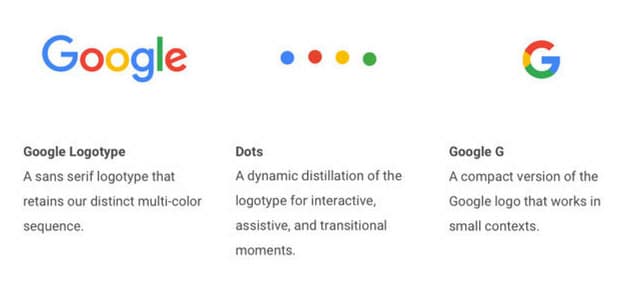
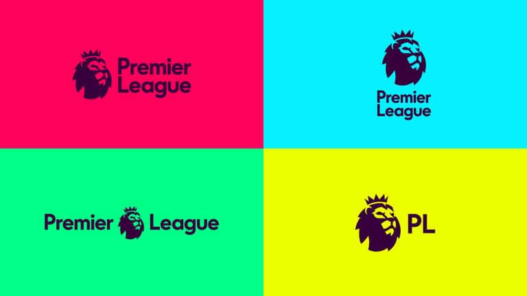
Below are a couple examples of responsive logos in action:
So let’s return to our original questions. Should we refer to “logo design” or “responsive logo design?” The answer is both. Today, branding and digital marketing experts should educate their clients that when they present them with a logo design, they will actually present them with four logo designs. One for each size requirement.
Keep in mind the different sizes are not dependent upon the devices a viewer might use, but instead the importance of conveying the full value of your brand and establishing brand recognition—the ultimate goal of any logo placement.